Most business signs fail at the one thing they're supposed to do — communicate. Here's how to design one that doesn't. The principles, the letter-height math, and the mistakes that cost real money.
There's a specific kind of sign that genuinely upsets us. It's the one where the business owner clearly spent real money — fabricated channel letters, illuminated cabinet, professional install — and you still can't tell what the business does from the road. The phone number is in there. The website is in there. The hours are in there. And somewhere in the middle, in 4-inch letters, is the business name. You drive past it every day for a year and never register the name. That sign just cost somebody $15,000 to be invisible.
This happens because most people think of a sign like a business card or a brochure — a place to put information. A sign isn't either of those things. A sign is a billboard that has about three seconds to do its job. If you treat it like anything else, it will fail. After 37+ years of designing signs in Jacksonville, here's how we think about getting them right.
A driver moving 35 miles per hour covers about 50 feet every second. From the moment your sign enters their peripheral vision to the moment it's gone, they have somewhere between two and four seconds. In that window, they have to see the sign, read it, and decide whether what they read is relevant to them. Three seconds, three jobs.
This isn't a creative constraint — it's a physical one. The single most useful thing you can do when designing a sign is hold a stopwatch and ask yourself: in three seconds, can someone read this? If the answer is no, the sign is broken, regardless of how good it looks parked at the curb where the designer presented it.
Every good sign answers exactly one question for the reader. Usually it's "what is this business called?" Sometimes it's "what does this business do?" Occasionally it's "where do I turn?" Rarely is it more than one thing.
The most common design mistake we see is treating a sign as a list of things you'd like the customer to know — name, tagline, services offered, address, phone, website, hours, social handles, and an "Open" indicator. Every one of those things competes for the same three seconds. The reader retains exactly none of them.
The fix is brutally simple: pick the one thing that matters most, give it 80% of the sign's visual weight, and treat everything else as a candidate for removal. If you can't bring yourself to remove a piece of information, ask whether it could go on the door, the window, the website, or nowhere at all. The honest answer is almost always nowhere at all.
The industry rule of thumb is one inch of letter height per ten feet of expected viewing distance. That's the threshold for comfortable, confident readability — what the United States Sign Council and FHWA studies treat as the "ideal" read. There's a longer "maximum" distance at which a letter can technically be read, roughly two-and-a-half times farther, but you don't design to maximum. You design to ideal, because at maximum distance the reader is squinting.
| Letter height | Ideal read distance | Maximum read distance |
|---|---|---|
| 3" | 30 ft | 100 ft |
| 4" | 40 ft | 150 ft |
| 6" | 60 ft | 200 ft |
| 8" | 80 ft | 270 ft |
| 10" | 100 ft | 350 ft |
| 12" | 120 ft | 400 ft |
| 15" | 150 ft | 525 ft |
| 18" | 180 ft | 630 ft |
| 24" | 240 ft | 840 ft |
| 36" | 360 ft | 1,260 ft |
Apply this practically. Your storefront sign sits 60 feet from where a driver first sees it as they slow to turn into the parking lot. Six-inch letters get the job done. The 4-inch phone number underneath? Unreadable until they're already parked — at which point they don't need it. Cut it from the sign.
For monument signs on a 45-mph road, the read-distance has to start farther out. Letters under 10 inches are wasted. For a pylon sign on a 55-mph stretch of highway, 18 inches is the floor, not the ceiling.
Print it at scale, tape it to a wall, walk backward until you can barely read it. Now measure your distance. That's your sign's ideal read distance. Compare it to the actual distance from your sign location to the road. If those numbers don't match, the design isn't done yet.
Legibility comes from contrast — the brightness difference between the letters and the background — far more than from font choice or color trends. The most readable sign in the world is black on yellow. Second is black on white, then yellow on black, then white on red, then white on green. These aren't aesthetic recommendations; they're measured outcomes from highway and traffic-control studies.
The implication: if you have a sophisticated brand color palette of dusty rose and warm tan, your sign is going to be hard to read from the road. There's no way around that — those colors don't have enough contrast. We tell customers all the time: the sign is the place where brand identity has to compromise with physics. You can still use your colors. You just have to be honest about how the sign will perform if you use them at low contrast.
Every additional typeface on a sign reduces its read speed. The eye has to recalibrate to a new letter shape every time it encounters one. On a sign that has three seconds to be read, you can't afford that recalibration.
Pick one strong sans-serif or one strong serif for the primary text. If you need a second face for secondary information (a tagline, a category descriptor), make sure it's clearly subordinate in size and weight — not a competing voice. And if you find yourself reaching for a third font, what you're really doing is admitting that the sign has too much going on.
The space around your letters is what lets the letters be read. Cramped signs feel busy, look cheap, and read slowly. Generous signs feel confident and read fast. The rule we use in the shop: aim for at least 30% of the sign face to be empty space. If you're below that, you're cramming.
This is the single hardest principle to convince customers of. There's a deep instinct that says "I paid for this sign face, I should use all of it." The exact opposite is true. The space you leave empty is doing the work of making the rest legible.
Belongs: Your business name. What you do, if it's not obvious from the name. (A name like "Sunshine Pediatrics" doesn't need explanation. "Atlantic Group" probably needs "Insurance" underneath it.)
Doesn't belong: Phone number, website, email, hours, address, social media handles, taglines that aren't already part of the brand, lists of services, "Established 1987" copy, "Family-owned" copy, "Now hiring" notices. All of these are real information that should live somewhere — on the door, in the window, on the website, in print collateral. None of them belong on the main exterior sign. The reader can't process them at speed, and trying to include them makes the name itself harder to read.
The customer who needs your phone number is the customer who already knows your name — they'll find your number on Google in three seconds. The sign doesn't need to do that job. The sign needs to make sure that customer knew you exist in the first place.
If you want to take sign design seriously — even as a business owner who isn't designing the sign yourself, but who's about to pay for one — the single best resource is Mike Stevens' Mastering Layout: On the Art of Eye Appeal. It was published in 1991 by ST Publications and it's still the closest thing the industry has to a foundational text.
Stevens lays out the principles that everything above this section is downstream of: hierarchy, eye flow, harmony, contrast, simplicity. He treats sign design as a discipline rooted in optics and human perception, not graphic style. Most of what we know about layout in this shop traces back to that book or to people who learned from it. If you're buying a sign and you want to be a smarter customer, read the first chapter. It will save you money.
The principles above aren't theoretical. Here are four projects from our shop that we think about when we talk about effective sign design.
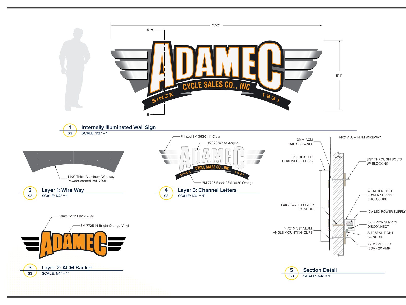
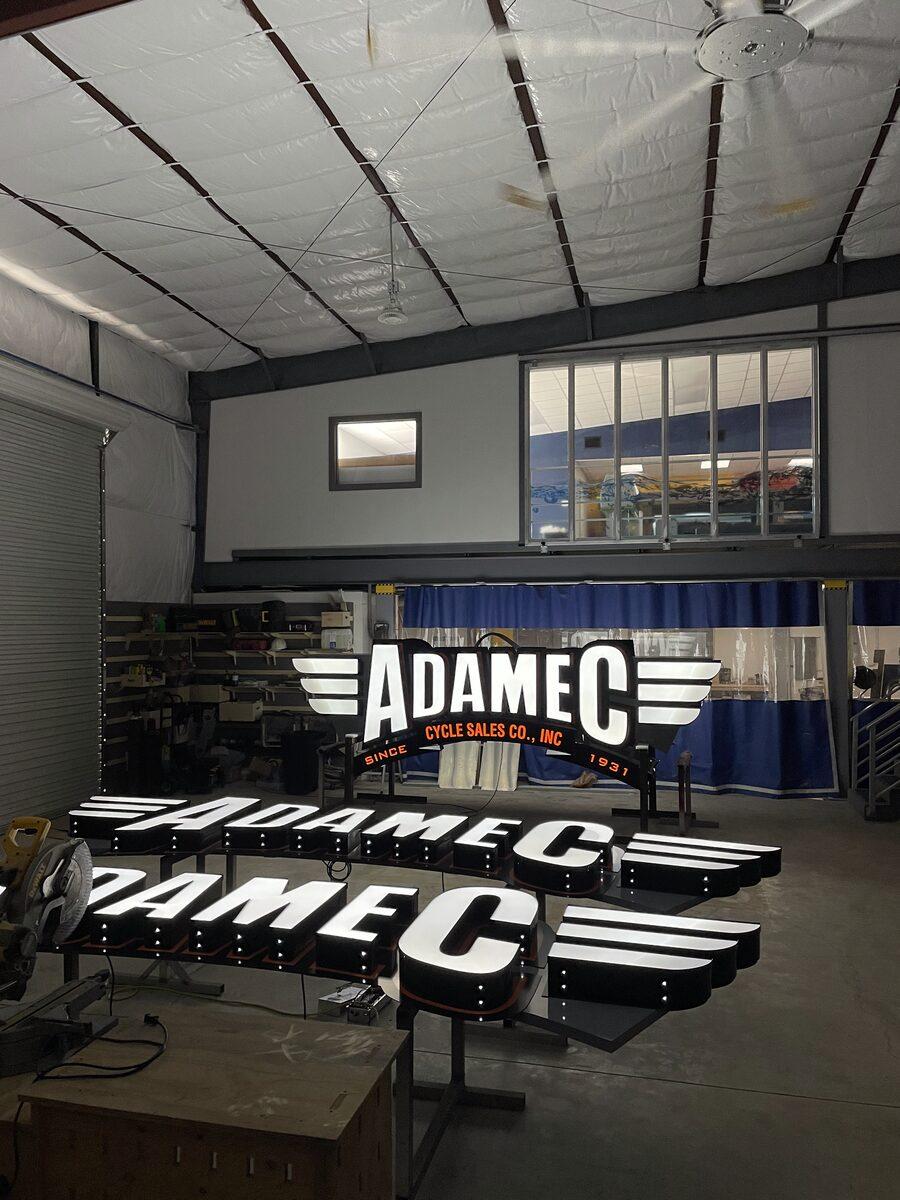
Adamec Cycle Sales. A custom-fabricated channel letter set built for the Adamec storefront on Atlantic Boulevard. The wordmark dominates; the smaller "CYCLE SALES CO., INC" arc and the "SINCE 1931" ribbon read as supporting credit, not competing message. The wings on either side add scale and visual presence without adding a single letter the reader has to decode. There is no phone number, no website, no hours — anyone who needs that information will look it up in three seconds on their phone. From the road, this sign's only job is to make sure they register the name. It does that.
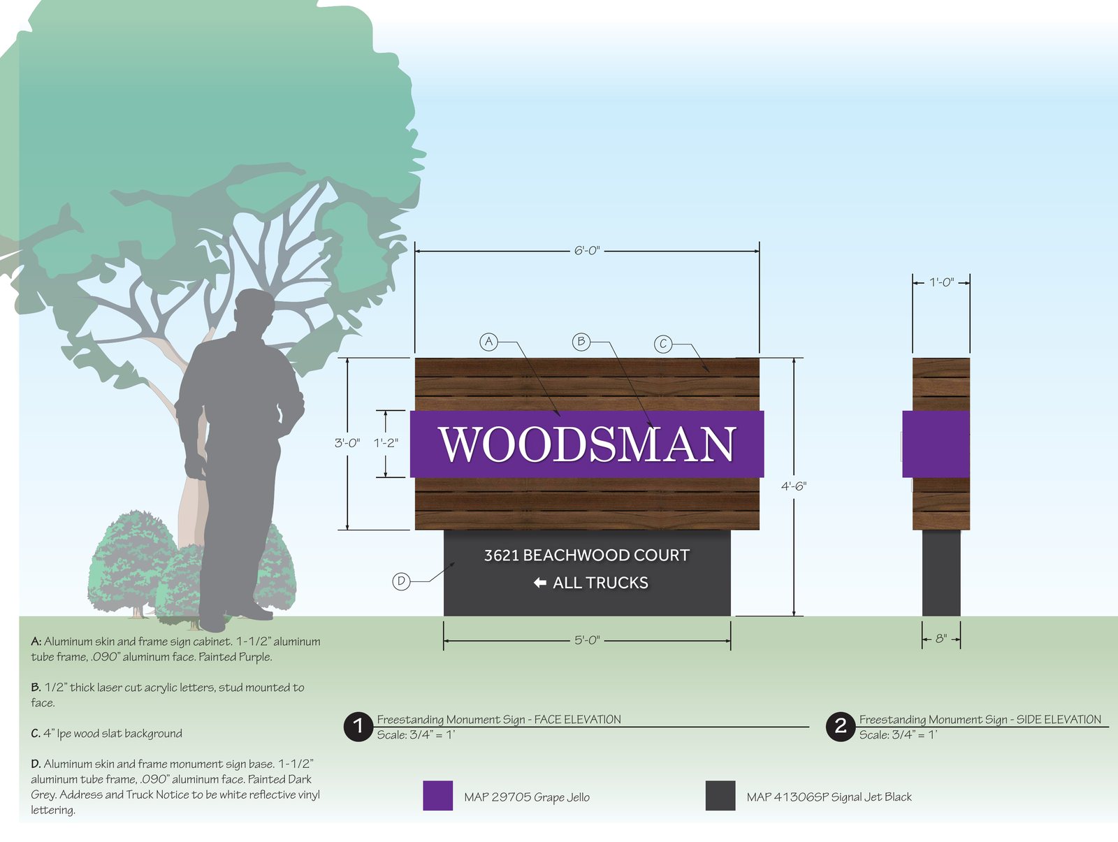
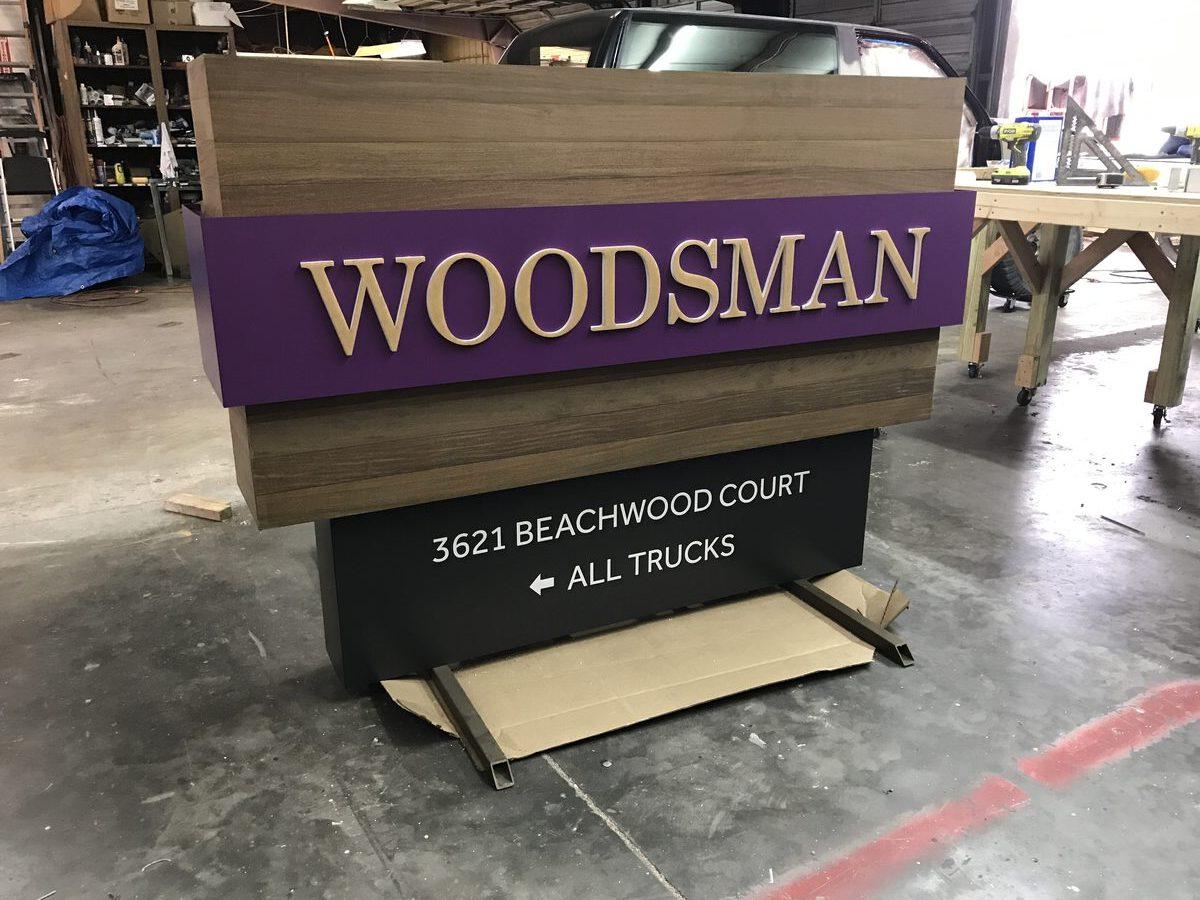
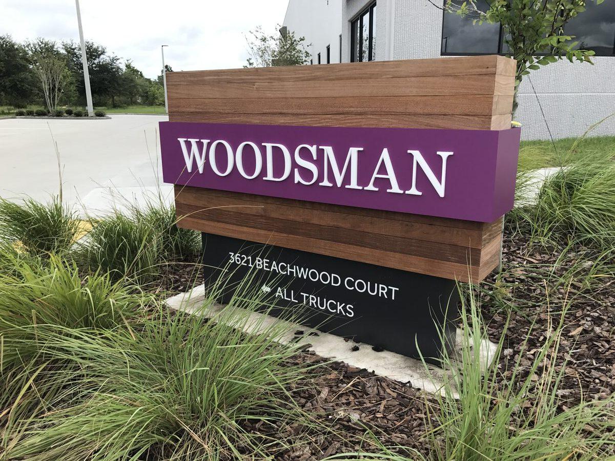
Woodsman. A monument sign with Ipe wood accents and dimensional acrylic letters. One word. Generous breathing room. The material tells you what kind of business this is before you read the name — premium, deliberate, considered. The sign and the brand reinforce each other; neither has to over-explain. (The installed version is at the top of this post; what's above is the proof we built from.)
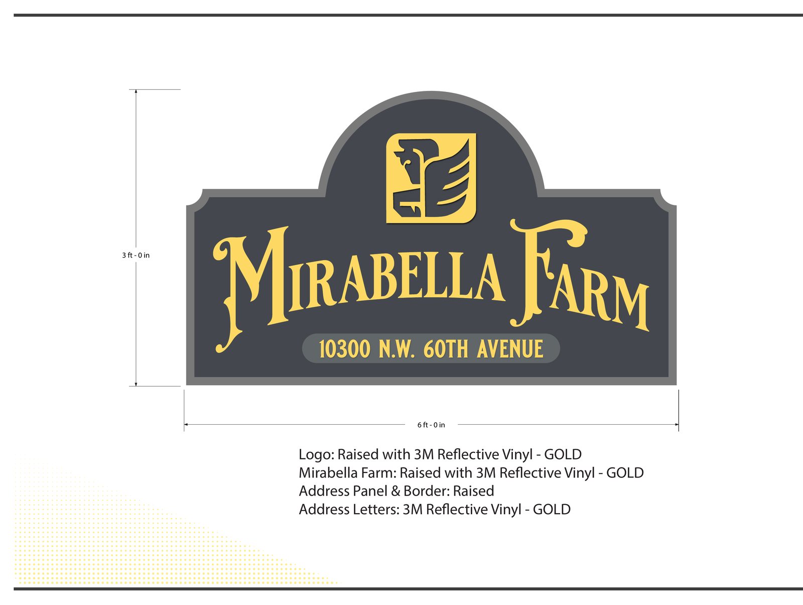
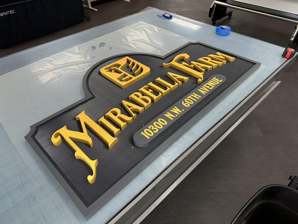
Mirabella Farm. A carved HDU monument sign with raised letters painted in bright yellow over a textured dark grey background — beautiful, measurable contrast. The wordmark dominates; the property address sits beneath it as much smaller subordinate copy, useful for deliveries without competing for attention. Even the small heraldic logo above is sized so the reader's eye lands on "Mirabella Farm" first. This is what hierarchy looks like in practice.
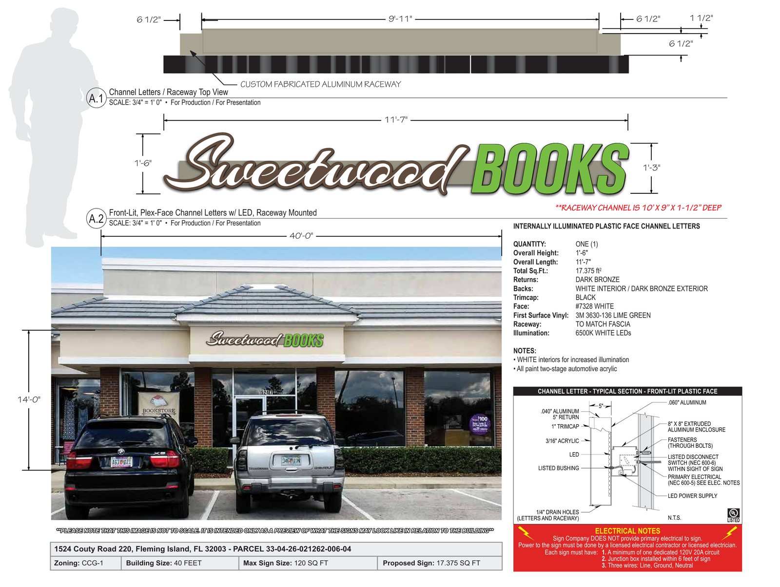
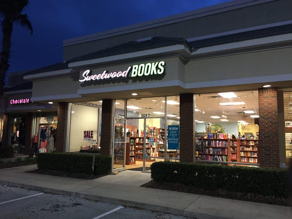
Sweetwood Books. A storefront sign for an independent bookstore — illuminated channel letters mounted on a raceway. This is the rare case where two fonts work because the hierarchy is unmistakable: a flowing script "Sweetwood" reads as the name; a bold block "BOOKS" reads as the category. Different sizes, different weights, different colors — but obviously one is the name and one is the descriptor. The category cue is built into the wordmark itself, which is why no tagline or list of services has to be added. From a block away you know what's in there. From across the street, you can read it.
What these four projects have in common isn't a style or a material. It's a willingness, at the design stage, to leave information off — to trust the reader and trust the brand to do their respective jobs. That's the hardest part of effective sign design and the part most worth getting right.
If you take one principle from this post into your next sign project, make it this one: the goal of a sign is not to convey information. The goal of a sign is to be remembered. Everything else — letter height, contrast, font choice, white space — is in service of that single outcome. Designed well, a sign earns its budget back in walk-in traffic and brand recognition for a decade. Designed badly, it spends its life as expensive noise on the side of a building.
We've been doing this in Jacksonville since 1987 and we genuinely care about the outcome. If you're planning a new sign — or replacing one that hasn't been working — we'd rather have a 20-minute conversation about what you're trying to accomplish than send a quote into the void.
Start the Conversation